


9:41


My Hill’s Account
Redesigning a more intuitive and robust “My Account”
Overview
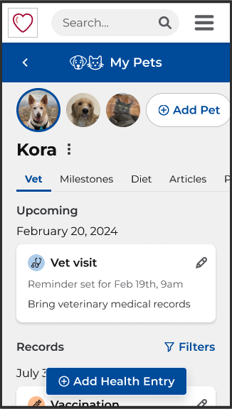
Hill’s Profile Hub is a personalized space to learn and manage your pet’s health while being rewarded for brand loyalty. When I joined the team as lead UX Designer, a consultancy had just helped to launch an MVP of the product. The navigation was difficult, and the features were not discoverable. The design of the pets page was also not scalable to add new features.
Solution
I redesigned the site, informed by user testing and business goals, with a focus on task-based design, responsive layout, and accessibility built into a new design system. This improved the SUS score by 13 points and facilitated adoption by 2 more markets - Japan and Australia.
Role
Lead UX Designer and Researcher
Duration
January 2023 - September 2024
Team
UX Intern, Global Development team, Product Owner + Manager, local and global marketing / business teams (US, Brazil, Canada, UK, France, Japan, Australia)

The Challenge
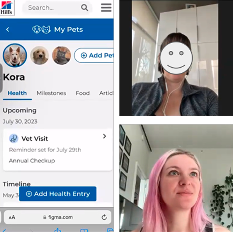
Using Heuristics Evaluation, User Testing, and Sprig survey data, I found major usability problems with the MVP site’s navigation. The layout presented difficulty in adding and scaling new features. I also uncovered a low perceived user value from the MVP features from interviews and testing. Due to these reasons, many local geos did not want to advertise or adopt the product. I spent my time on this project tackling all these issues, creating a design system for future modularity and efficiency, balancing new requests from local and global business teams, and working towards future features.
- Information architecture is unclear, and there is no indication of what page the user is currently on
- Users mistake the home page for the My Pets page, making the features on My Pets (such as milestones) very hard to discover
- Layout is especially difficult on mobile as elements like the pet cards are too large
- Page design is very limiting, and is not scalable for new features
- There are severe usability issues such as "View Pet" navigating to the editing page
Background Research + Competitive Analysis
I began my design process by reviewing competitors in online pet care and retail. I analyzed their websites and apps to understand how they address user needs, particularly those related to account management, pet health and profile management, and user-friendly design.
I also utilized insights from the Baymard Institute’s UX research repository. Although most articles pertain to e-commerce, the account and navigation-related research helped me understand specific usability issues to avoid.
Using this background research, I created the first iteration of the information architecture. This included a new feature, health tracking, which was determined to be one of the most valuable new features from the consultancy’s previous user research and business input.
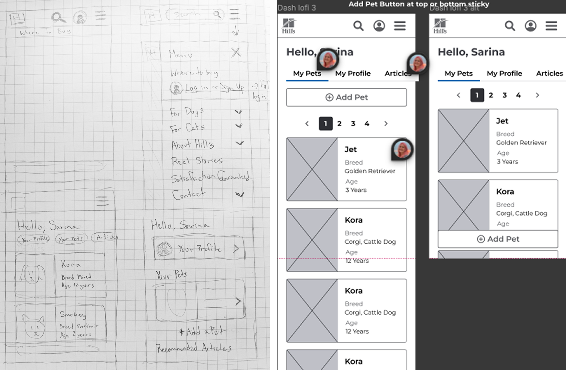
Sketching + Lo-fi Designs
Sketching with pen and paper, I explored divergent ideas for the site navigation. I then created lo-fi wireframes to visualize three of these ideas in user flows.
I shared these wireframes with my UX colleagues during a design critique. The feedback was very helpful, with the most important point being that my design focused primarily on displaying information, whereas the focus should be on ensuring that the main tasks take priority.
Users already know their pet’s breed and age and would instead want to focus on tasks like adding health entries or tracking milestones. I was focusing too much on how to rearrange the information on the page to be more readable and needed to take a step back to more deeply understand the user tasks, especially in light of the new health tracking feature.
Mid-fi Designs + Testing
Using the feedback from the critique, I moved forward with a more task-oriented design for mid-fidelity. The main tasks I highlighted were adding a new pet, health entry, allergy, and food. I created a clickable Figma prototype to test with users on Usertesting.com.
- 5 moderated usability tests
- Pet parents ranging in age from 28 to 55
- 1 hour per session
Key Findings
- Users thought the overall site was intuitive and easy to use
- Confusion over the content of each tab in the navigation on the My Pets page
- Participants were unsure of which tab would hold which task
- "Add Health Entry" floating action button was difficult for one user to notice at first glance
- As this was a minor issue, I kept the button positioning but tried to give a more prominent visual treatment for hi-fi

Card Sort + Tree Testing
To address the confusion of the content in each tab, I used card sorting to understand where users would naturally place content. Through this exercise, I was also able to better name category labels, like changing “Health” to “Vet,” and discovered some items fit into more than one category. “Allergies,” for example, were placed into “Diet” as much as “Profile.” This led me to learn about polyhierarchies which allows flexibility for multiple paths.
Based on this, I edited the information architecture and conducted tree testing using Optimal Workshop. The tree test revealed that the polyhierarchies worked to capture multiple user mental models of where items were located. I then moved forward with high-fidelity design and prototyping.
Hi-fi Designs + Testing
I created a high-fidelity Figma prototype with each task’s happy path and included more realistic content.
- 5 moderated usability tests
- Pet parents ranging in age from 19 to 60
- 1 hour per session
Key Findings
- Overall, the site is efficient, clean, and learnable
- Some users were frustrated with “circular navigation”
- Order / fold of tabs affected efficiency of completion
- The articles full page and tab on pets are redundant
- Add Health Entry button still not immediately noticed
For each issue that I found, I addressed with a new solution in the next iteration of design which was passed to developers.
Circular Navigation
The polyhierarchy allowed every user to complete all tasks successfully. However, two users expressed some frustration with “circular navigation” since they would be redirected to the main parent to edit something if they found it through the second parent.
“I wish you can edit in both sections instead of going in a circle with linking.”
“I don't like having to go to profile to edit this. I want to edit directly on the Diet page.”


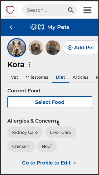
Solution
Make the children editable from both parents. In the Allergies & Concerns on the Diet tab example, I replaced the “Go to Profile to Edit” button with an “Edit” button.

Fold of Tabs + Articles Tab
The fold of the tabs (horizontal cut-off) negatively affected the efficiency of task completion. When adding an allergy, users first went to the “Diet” tab as it is first visible and “Profile” is past the fold. Users then completed the task through the “Go to Profile to Edit” link.
Two users also expressed that the Articles tab was redundant to the main articles page, and was unnecessary to have on the pets page.
“I didn’t notice the Profile tab at the end of the list.”

Solution
Remove the articles tab to reduce confusion with the main articles page, and to fit all the tabs on screen with no scrolling.
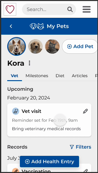
Add Health Entry Button
Although I tried to make it more prominent visually, the Add Health Entry button was still not immediately noticeable. Most users hesitated and did not immediately notice the floating action button. Because other editing was done in-line, they expected the same on the Vet tab.
“I was looking for something at the top to add… I didn’t notice this Add Health Entry Button.”
“Editing the allergy was in-line so I was expecting the same for adding medication.”
Solution
Move the Add Health Entry button to be in-line at the top of the Vet tab, which users mentioned was where they expected the button to be located.

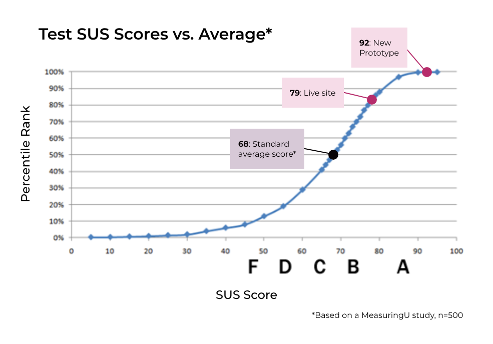
Hi-fi System Usability Scale (SUS) Score
I gathered the prototype’s SUS score using the standardized questionnaire. Since we only had 5 participants, we took this score with a grain of salt.
92.5
SUS score for Hi-fi prototype (n=5)
Live Site Benchmark Testing
After gathering the SUS score for the high-fidelity prototype, I needed something to compare this to. I decided to conduct the same usability testing on the live site for benchmarking, but with some tweaks since the live site didn’t include health tracking. In turn, this also contributed to the SUS score as it includes less functionality.
The benchmark testing re-confirmed the usability issues with the live site as well as revealed more in-depth information about the current lack of perceived value. Users also expressed that the live site lacked emotion and interactivity.
“You’re taking this information from me, what am I getting back? There is no conversation. I don't think I would go back into the site.”
“There’s nothing friendly about this page design. There is no emotion here - it's not an enjoyable experience, there’s nothing fun and cute about it.”
79
SUS score for live site (n=10)
17%
Increase in SUS score from live site to hi-fi prototype
The new prototype scored 13 points higher than the live site. As mentioned before, however, the live site did not have health tracking functionality which contributed to the lower score and low value perception.
This testing also guided my final designs to be more personable and fun, and I recommended to the team that they invest in illustrations (especially for milestones) in the future to continue to add more character to the application.

Working with Development
Since the health tracking functionality was not yet developed, I scaled this feature back for design delivery to development, and prepared another version for when the team was ready to implement that feature in the future.
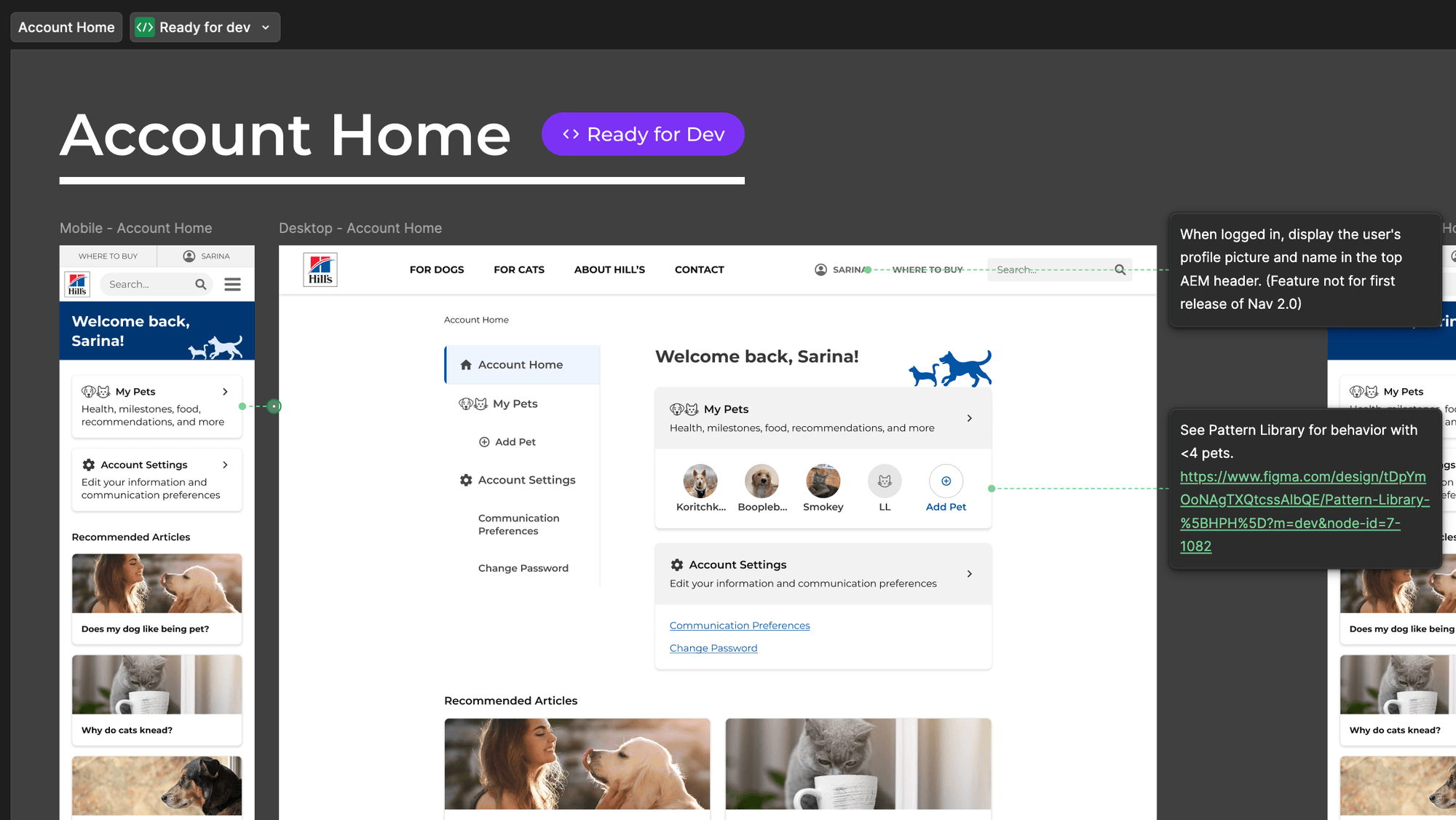
During my time on the team, I used my developers' feedback to re-organize the Figma to be easier for them to use. I re-organized and re-named pages, moved all breakpoints to be next to each other, and used headers and status labels. For delivery, I utilized Figma's annotations tool to communicate interactions and accessibility notes and worked closely with developers to answer any questions. I also worked with the product manager to help manage a CMS spreadsheet to reduce redundant designs for things like error messages.
After sharing the new designs with with local business teams, two more markets decided they wanted to adopt the new My Account experience: Japan and Australia. The development team is now working to roll out the new designs to these markets.

Japan

Australia
New markets to adopt the new designs
Production
As of summer 2025, the new My Account experience is currently live in Japan, Brazil, Canada, France, and the UK. You can create an account to see the experience live:
See in Production
Live site demo (Canada)
Design System
When I first joined the team, the consultancy had built out the product mainly without using components, which made the designs very difficult to edit and maintain. The Hill's Pet team also had no global design system. So, I decided to build a design system little by little while also redesigning Hill's My Account. I collaborated with other designers and consultants on other Pet and Vet teams to ensure the components were robust enough to suit a multitude of needs.
I also worked to build accessibility into the design system from the beginning, and collaborated with developers to ensure we used proper ARIA labeling and tagging. I paid close attention to color contrast, font size, clickable target sizes, tab order, and assistive device compatibility.
If you would like to know more about my work in this space, please contact me at sarina.katznelson@gmail.com.
Thank you for reading.

Previous Case Study
Next Case Study

9:41
My Hill’s Account
Redesigning a more intuitive and robust “My Account”
Overview
Hill’s Profile Hub is a personalized space to learn and manage your pet’s health while being rewarded for brand loyalty. When I joined the team as lead UX Designer, a consultancy had just helped to launch an MVP of the product. The navigation was difficult, and the features were not discoverable. The design of the pets page was also not scalable to add new features.
Solution
I redesigned the site, informed by user testing and business goals, with a focus on task-based design, responsive layout, and accessibility built into a new design system. This improved the SUS score by 13 points and facilitated adoption by 2 more markets - Japan and Australia.
Role
Lead UX Designer and Researcher
Duration
January 2023 - September 2024
Team
UX Intern, Global Development team, Product Owner + Manager, local and global marketing / business teams (US, Brazil, Canada, UK, France, Japan, Australia)
The Challenge
Using Heuristics Evaluation, User Testing, and Sprig survey data, I found major usability problems with the MVP site’s navigation. The layout presented difficulty in adding and scaling new features. I also uncovered a low perceived user value from the MVP features from interviews and testing. Due to these reasons, many local geos did not want to advertise or adopt the product. I spent my time on this project tackling all these issues, creating a design system for future modularity and efficiency, balancing new requests from local and global business teams, and working towards future features.
- Information architecture is unclear, and there is no indication of what page the user is currently on
- Users mistake the home page for the My Pets page, making the features on My Pets (such as milestones) very hard to discover
- Layout is especially difficult on mobile as elements like the pet cards are too large
- Page design is very limiting, and is not scalable for new features
- There are severe usability issues such as "View Pet" navigating to the editing page
Background Research + Competitive Analysis
I began my design process by reviewing competitors in online pet care and retail. I analyzed their websites and apps to understand how they address user needs, particularly those related to account management, pet health and profile management, and user-friendly design.
I also utilized insights from the Baymard Institute’s UX research repository. Although most articles pertain to e-commerce, the account and navigation-related research helped me understand specific usability issues to avoid.
Using this background research, I created the first iteration of the information architecture. This included a new feature, health tracking, which was determined to be one of the most valuable new features from the consultancy’s previous user research and business input.
Sketching + Lo-fi Designs
Sketching with pen and paper, I explored divergent ideas for the site navigation. I then created lo-fi wireframes to visualize three of these ideas in user flows.
I shared these wireframes with my UX colleagues during a design critique. The feedback was very helpful, with the most important point being that my design focused primarily on displaying information, whereas the focus should be on ensuring that the main tasks take priority.
Users already know their pet’s breed and age and would instead want to focus on tasks like adding health entries or tracking milestones. I was focusing too much on how to rearrange the information on the page to be more readable and needed to take a step back to more deeply understand the user tasks, especially in light of the new health tracking feature.
Mid-fi Designs + Testing
Using the feedback from the critique, I moved forward with a more task-oriented design for mid-fidelity. The main tasks I highlighted were adding a new pet, health entry, allergy, and food. I created a clickable Figma prototype to test with users on Usertesting.com.
- 5 moderated usability tests
- Pet parents ranging in age from 28 to 55
- 1 hour per session
Key Findings
- Users thought the overall site was intuitive and easy to use
- Confusion over the content of each tab in the navigation on the My Pets page
- Participants were unsure of which tab would hold which task
- "Add Health Entry" floating action button was difficult for one user to notice at first glance
- As this was a minor issue, I kept the button positioning but tried to give a more prominent visual treatment for hi-fi
Card Sort + Tree Testing
To address the confusion of the content in each tab, I used card sorting to understand where users would naturally place content. Through this exercise, I was also able to better name category labels, like changing “Health” to “Vet,” and discovered some items fit into more than one category. “Allergies,” for example, were placed into “Diet” as much as “Profile.” This led me to learn about polyhierarchies which allows flexibility for multiple paths.
Based on this, I edited the information architecture and conducted tree testing using Optimal Workshop. The tree test revealed that the polyhierarchies worked to capture multiple user mental models of where items were located. I then moved forward with high-fidelity design and prototyping.
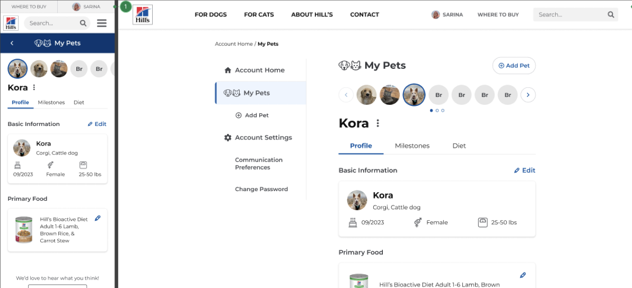
Hi-fi Designs + Testing
I created a high-fidelity Figma prototype with each task’s happy path and included more realistic content.
- 5 moderated usability tests
- Pet parents ranging in age from 19 to 60
- 1 hour per session
Key Findings
- Overall, the site is efficient, clean, and learnable
- Some users were frustrated with “circular navigation”
- Order / fold of tabs affected efficiency of completion
- The articles full page and tab on pets are redundant
- Add Health Entry button still not immediately noticed
For each issue that I found, I addressed with a new solution in the next iteration of design which was passed to developers.
Circular Navigation
The polyhierarchy allowed every user to complete all tasks successfully. However, two users expressed some frustration with “circular navigation” since they would be redirected to the main parent to edit something if they found it through the second parent.
“I wish you can edit in both sections instead of going in a circle with linking.”
“I don't like having to go to profile to edit this. I want to edit directly on the Diet page.”
Solution
Make the children editable from both parents. In the Allergies & Concerns on the Diet tab example, I replaced the “Go to Profile to Edit” button with an “Edit” button.
Fold of Tabs + Articles Tab
The fold of the tabs (horizontal cut-off) negatively affected the efficiency of task completion. When adding an allergy, users first went to the “Diet” tab as it is first visible and “Profile” is past the fold. Users then completed the task through the “Go to Profile to Edit” link.
Two users also expressed that the Articles tab was redundant to the main articles page, and was unnecessary to have on the pets page.
“I didn’t notice the Profile tab at the end of the list.”
Solution
Remove the articles tab to reduce confusion with the main articles page, and to fit all the tabs on screen with no scrolling.
Add Health Entry Button
Although I tried to make it more prominent visually, the Add Health Entry button was still not immediately noticeable. Most users hesitated and did not immediately notice the floating action button. Because other editing was done in-line, they expected the same on the Vet tab.
“I was looking for something at the top to add… I didn’t notice this Add Health Entry Button.”
“Editing the allergy was in-line so I was expecting the same for adding medication.”
Solution
Move the Add Health Entry button to be in-line at the top of the Vet tab, which users mentioned was where they expected the button to be located.
Hi-fi System Usability Scale (SUS) Score
I gathered the prototype’s SUS score using the standardized questionnaire. Since we only had 5 participants, we took this score with a grain of salt.
92.5
SUS score for Hi-fi prototype (n=5)
Live Site Benchmark Testing
After gathering the SUS score for the high-fidelity prototype, I needed something to compare this to. I decided to conduct the same usability testing on the live site for benchmarking, but with some tweaks since the live site didn’t include health tracking. In turn, this also contributed to the SUS score as it includes less functionality.
The benchmark testing re-confirmed the usability issues with the live site as well as revealed more in-depth information about the current lack of perceived value. Users also expressed that the live site lacked emotion and interactivity.
“You’re taking this information from me, what am I getting back? There is no conversation. I don't think I would go back into the site.”
“There’s nothing friendly about this page design. There is no emotion here - it's not an enjoyable experience, there’s nothing fun and cute about it.”
79
SUS score for live site (n=10)
17%
Increase in SUS score from live site to hi-fi prototype
The new prototype scored 13 points higher than the live site. As mentioned before, however, the live site did not have health tracking functionality which contributed to the lower score and low value perception.
This testing also guided my final designs to be more personable and fun, and I recommended to the team that they invest in illustrations (especially for milestones) in the future to continue to add more character to the application.
Working with Development
Since the health tracking functionality was not yet developed, I scaled this feature back for design delivery to development, and prepared another version for when the team was ready to implement that feature in the future.
During my time on the team, I used my developers' feedback to re-organize the Figma to be easier for them to use. I re-organized and re-named pages, moved all breakpoints to be next to each other, and used headers and status labels. For delivery, I utilized Figma's annotations tool to communicate interactions and accessibility notes and worked closely with developers to answer any questions. I also worked with the product manager to help manage a CMS spreadsheet to reduce redundant designs for things like error messages.
After sharing the new designs with with local business teams, two more markets decided they wanted to adopt the new My Account experience: Japan and Australia. The development team is now working to roll out the new designs to these markets.
Japan
Australia
New markets to adopt the new designs
Production
As of summer 2025, the new My Account experience is currently live in Japan, Brazil, Canada, France, and the UK. You can create an account to see the experience live:
See in Production
Live site demo (Canada)
Design System
When I first joined the team, the consultancy had built out the product mainly without using components, which made the designs very difficult to edit and maintain. The Hill's Pet team also had no global design system. So, I decided to build a design system little by little while also redesigning Hill's My Account. I collaborated with other designers and consultants on other Pet and Vet teams to ensure the components were robust enough to suit a multitude of needs.
I also worked to build accessibility into the design system from the beginning, and collaborated with developers to ensure we used proper ARIA labeling and tagging. I paid close attention to color contrast, font size, clickable target sizes, tab order, and assistive device compatibility.
If you would like to know more about my work in this space, please contact me at sarina.katznelson@gmail.com.
Thank you for reading.
Previous Case Study
Next Case Study
9:41
My Hill’s Account
Redesigning a more intuitive and robust “My Account”
Overview
Hill’s Profile Hub is a personalized space to learn and manage your pet’s health while being rewarded for brand loyalty. When I joined the team as lead UX Designer, a consultancy had just helped to launch an MVP of the product. The navigation was difficult, and the features were not discoverable. The design of the pets page was also not scalable to add new features.
Solution
I redesigned the site, informed by user testing and business goals, with a focus on task-based design, responsive layout, and accessibility built into a new design system. This improved the SUS score by 13 points and facilitated adoption by 2 more markets - Japan and Australia.
Role
Lead UX Designer and Researcher
Duration
January 2023 - September 2024
Team
UX Intern, Global Development team, Product Owner + Manager, local and global marketing / business teams (US, Brazil, Canada, UK, France, Japan, Australia)

The Challenge
Using Heuristics Evaluation, User Testing, and Sprig survey data, I found major usability problems with the MVP site’s navigation. The layout presented difficulty in adding and scaling new features. I also uncovered a low perceived user value from the MVP features from interviews and testing. Due to these reasons, many local geos did not want to advertise or adopt the product. I spent my time on this project tackling all these issues, creating a design system for future modularity and efficiency, balancing new requests from local and global business teams, and working towards future features.
- Information architecture is unclear, and there is no indication of what page the user is currently on
- Users mistake the home page for the My Pets page, making the features on My Pets (such as milestones) very hard to discover
- Layout is especially difficult on mobile as elements like the pet cards are too large
- Page design is very limiting, and is not scalable for new features
- There are severe usability issues such as "View Pet" navigating to the editing page
Background Research + Competitive Analysis
I began my design process by reviewing competitors in online pet care and retail. I analyzed their websites and apps to understand how they address user needs, particularly those related to account management, pet health and profile management, and user-friendly design.
I also utilized insights from the Baymard Institute’s UX research repository. Although most articles pertain to e-commerce, the account and navigation-related research helped me understand specific usability issues to avoid.
Using this background research, I created the first iteration of the information architecture. This included a new feature, health tracking, which was determined to be one of the most valuable new features from the consultancy’s previous user research and business input.
Sketching + Lo-fi Designs
Sketching with pen and paper, I explored divergent ideas for the site navigation. I then created lo-fi wireframes to visualize three of these ideas in user flows.
I shared these wireframes with my UX colleagues during a design critique. The feedback was very helpful, with the most important point being that my design focused primarily on displaying information, whereas the focus should be on ensuring that the main tasks take priority.
Users already know their pet’s breed and age and would instead want to focus on tasks like adding health entries or tracking milestones. I was focusing too much on how to rearrange the information on the page to be more readable and needed to take a step back to more deeply understand the user tasks, especially in light of the new health tracking feature.
Mid-fi Designs + Testing
Using the feedback from the critique, I moved forward with a more task-oriented design for mid-fidelity. The main tasks I highlighted were adding a new pet, health entry, allergy, and food. I created a clickable Figma prototype to test with users on Usertesting.com.
- 5 moderated usability tests
- Pet parents ranging in age from 28 to 55
- 1 hour per session
Key Findings
- Users thought the overall site was intuitive and easy to use
- Confusion over the content of each tab in the navigation on the My Pets page
- Participants were unsure of which tab would hold which task
- "Add Health Entry" floating action button was difficult for one user to notice at first glance
- As this was a minor issue, I kept the button positioning but tried to give a more prominent visual treatment for hi-fi

Card Sort + Tree Testing
To address the confusion of the content in each tab, I used card sorting to understand where users would naturally place content. Through this exercise, I was also able to better name category labels, like changing “Health” to “Vet,” and discovered some items fit into more than one category. “Allergies,” for example, were placed into “Diet” as much as “Profile.” This led me to learn about polyhierarchies which allows flexibility for multiple paths.
Based on this, I edited the information architecture and conducted tree testing using Optimal Workshop. The tree test revealed that the polyhierarchies worked to capture multiple user mental models of where items were located. I then moved forward with high-fidelity design and prototyping.
Hi-fi Designs + Testing
I created a high-fidelity Figma prototype with each task’s happy path and included more realistic content.
- 5 moderated usability tests
- Pet parents ranging in age from 19 to 60
- 1 hour per session
Key Findings
- Overall, the site is efficient, clean, and learnable
- Some users were frustrated with “circular navigation”
- Order / fold of tabs affected efficiency of completion
- The articles full page and tab on pets are redundant
- Add Health Entry button still not immediately noticed
For each issue that I found, I addressed with a new solution in the next iteration of design which was passed to developers.
Circular Navigation
The polyhierarchy allowed every user to complete all tasks successfully. However, two users expressed some frustration with “circular navigation” since they would be redirected to the main parent to edit something if they found it through the second parent.
“I wish you can edit in both sections instead of going in a circle with linking.”
“I don't like having to go to profile to edit this. I want to edit directly on the Diet page.”
Solution
Make the children editable from both parents. In the Allergies & Concerns on the Diet tab example, I replaced the “Go to Profile to Edit” button with an “Edit” button.
Fold of Tabs + Articles Tab
The fold of the tabs (horizontal cut-off) negatively affected the efficiency of task completion. When adding an allergy, users first went to the “Diet” tab as it is first visible and “Profile” is past the fold. Users then completed the task through the “Go to Profile to Edit” link.
Two users also expressed that the Articles tab was redundant to the main articles page, and was unnecessary to have on the pets page.
“I didn’t notice the Profile tab at the end of the list.”
Solution
Remove the articles tab to reduce confusion with the main articles page, and to fit all the tabs on screen with no scrolling.
Add Health Entry Button
Although I tried to make it more prominent visually, the Add Health Entry button was still not immediately noticeable. Most users hesitated and did not immediately notice the floating action button. Because other editing was done in-line, they expected the same on the Vet tab.
“I was looking for something at the top to add… I didn’t notice this Add Health Entry Button.”
“Editing the allergy was in-line so I was expecting the same for adding medication.”
Solution
Move the Add Health Entry button to be in-line at the top of the Vet tab, which users mentioned was where they expected the button to be located.

Hi-fi System Usability Scale (SUS) Score
I gathered the prototype’s SUS score using the standardized questionnaire. Since we only had 5 participants, we took this score with a grain of salt.
92.5
SUS score for Hi-fi prototype (n=5)
Live Site Benchmark Testing
After gathering the SUS score for the high-fidelity prototype, I needed something to compare this to. I decided to conduct the same usability testing on the live site for benchmarking, but with some tweaks since the live site didn’t include health tracking. In turn, this also contributed to the SUS score as it includes less functionality.
The benchmark testing re-confirmed the usability issues with the live site as well as revealed more in-depth information about the current lack of perceived value. Users also expressed that the live site lacked emotion and interactivity.
“You’re taking this information from me, what am I getting back? There is no conversation. I don't think I would go back into the site.”
“There’s nothing friendly about this page design. There is no emotion here - it's not an enjoyable experience, there’s nothing fun and cute about it.”
79
SUS score for live site (n=10)
17%
Increase in SUS score from live site to hi-fi prototype
The new prototype scored 13 points higher than the live site. As mentioned before, however, the live site did not have health tracking functionality which contributed to the lower score and low value perception.
This testing also guided my final designs to be more personable and fun, and I recommended to the team that they invest in illustrations (especially for milestones) in the future to continue to add more character to the application.

Working with Development
Since the health tracking functionality was not yet developed, I scaled this feature back for design delivery to development, and prepared another version for when the team was ready to implement that feature in the future.
During my time on the team, I used my developers' feedback to re-organize the Figma to be easier for them to use. I re-organized and re-named pages, moved all breakpoints to be next to each other, and used headers and status labels. For delivery, I utilized Figma's annotations tool to communicate interactions and accessibility notes and worked closely with developers to answer any questions. I also worked with the product manager to help manage a CMS spreadsheet to reduce redundant designs for things like error messages.
After sharing the new designs with with local business teams, two more markets decided they wanted to adopt the new My Account experience: Japan and Australia. The development team is now working to roll out the new designs to these markets.
Japan
Australia
New markets to adopt the new designs
Production
As of summer 2025, the new My Account experience is currently live in Japan, Brazil, Canada, France, and the UK. You can create an account to see the experience live:
See in Production
Live site demo (Canada)
Design System
When I first joined the team, the consultancy had built out the product mainly without using components, which made the designs very difficult to edit and maintain. The Hill's Pet team also had no global design system. So, I decided to build a design system little by little while also redesigning Hill's My Account. I collaborated with other designers and consultants on other Pet and Vet teams to ensure the components were robust enough to suit a multitude of needs.
I also worked to build accessibility into the design system from the beginning, and collaborated with developers to ensure we used proper ARIA labeling and tagging. I paid close attention to color contrast, font size, clickable target sizes, tab order, and assistive device compatibility.
If you would like to know more about my work in this space, please contact me at sarina.katznelson@gmail.com.
Thank you for reading.
Previous Case Study
Next Case Study